A logo is more than just a symbol. It’s the face of your brand—the first thing people notice when they meet your business online or offline.
In 2026, logos need to do more than look nice. They must work perfectly on:
- Websites
- Mobile phones
- Social media profiles
- Product packaging
- Print materials
In short, your logo has to be flexible, clear, and modern.
In this post, we’ll talk about:
- Logo trends that will work in 2026
- Trends that are fading away
- How to choose the right logo for your brand
Whether you’re launching a new business or refreshing your brand, this guide will help you make the right design choices.
Why Logo Trends Matter in 2026
You might wonder: Do trends really matter? Yes, they do — but not because you must follow every new style. Trends matter because they reflect how people see brands today.
Here’s why logo trends are important in 2026:
Digital-first world
Most people now meet brands through their phones. So your logo must look good in small sizes and on screens.
Short attention spans
People decide within seconds if a brand is trustworthy. A clean and modern logo makes a strong first impression.
Brand needs to look consistent everywhere
Your logo must look good on:
- Instagram profile
- Website header
- Business card
- Product label
- YouTube channel
Your brand identity matters
A good logo builds trust and makes your brand look professional.
Logo Design Trends That Will Work in 2026
Now let’s talk about the styles that will be popular and effective in 2026.
Minimal & Clean Logos
Minimal logos are simple, clear, and easy to recognize.
Think of brands like Apple or Nike. Their logos are simple, but instantly recognizable.
Why minimal logos work
- They look modern
- They are easy to read
- They look good on phones
- They don’t get outdated quickly
When minimal works best
Minimal logos are perfect for:
- Tech companies
- Corporate brands
- Startups
- Service-based businesses
Example idea:
A simple monogram logo (like initials) or a clean icon with a clear brand name.
Variable Logos (Adaptive Logos)
In 2026, many brands are using adaptive logos. That means the logo changes slightly depending on where it is used.
For example:
- Full logo on website
- Simple icon for app
- Short version for social media
This helps your brand stay consistent while still looking clean and modern.
Why adaptive logos work
- They look good on all platforms
- They are flexible
- They make your brand look smart and modern
Bold Typography & Custom Fonts
Fonts are like the voice of your brand. Custom fonts are becoming more popular because they make a brand look unique and professional.
Why bold typography works
- It stands out
- It looks strong
- It makes your brand memorable
Best use cases
- Fashion brands
- Luxury products
- Creative agencies
- Tech startups
Tip: Avoid fonts that are too fancy or hard to read.
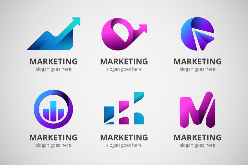
3D Logos & Gradients (Used Smartly)
3D logos and gradients are making a comeback, but only if they are used carefully.
Why they work
- They look modern
- They add depth
- They stand out on digital platforms
When to use them
- Gaming brands
- Tech products
- Entertainment brands
- Creative agencies
Important: Too much 3D or gradient can look heavy or outdated.
Geometric Shapes & Simple Icons
Geometric logos use shapes like circles, squares, triangles, and lines. They look clean, balanced, and professional.
Why geometric logos work
- They look stable and trustworthy
- They are easy to remember
- They work well in digital and print
These logos are great for:
- Finance
- Real estate
- Tech companies
- Corporate brands
Nostalgic Retro Logos (Modernized)
Retro logos are coming back, but with a modern twist.
These logos give a nostalgic feel, but they must still look clean and modern.
Why retro works
- It creates emotional connection
- It looks unique
- It works well for lifestyle brands
Tip: Use modern typography and simple shapes to keep it fresh.
Hand-drawn & Organic Logos
Hand-drawn logos look personal and authentic. They give a human touch to the brand.
These are great for:
- Cafes
- Local businesses
- Creative studios
- Artists
Why hand-drawn logos work
- They feel real and friendly
- They stand out from digital-looking logos
- They create a personal connection

Logo Trends That Don’t Work in 2026
Now let’s talk about the trends that are fading away or causing problems.
Overly Complex Logos
Complex logos look impressive but they are not practical.
Why complex logos fail
- They don’t look good on small screens
- They are hard to remember
- They look messy when printed
- They don’t scale well
In 2026, simple and clean logos win.
Heavy 90s Style Logos
90s style logos can look outdated unless your brand is intentionally retro.
Why they fail
- They look old-fashioned
- They may look unprofessional
- They can look cheap
Avoid this unless you are using retro intentionally.
Generic Icons (Too Common)
Icons like globes, light bulbs, and leaves are overused.
Why generic icons fail
- They don’t make your brand unique
- They look similar to other brands
- They don’t build a strong identity
Your logo should be unique and original.
Ultra Thin Fonts
Ultra-thin fonts might look stylish, but they are not practical.
Why thin fonts fail
- Hard to read on mobile
- Poor visibility on small screens
- Not suitable for digital-first brands
If you use thin fonts, make sure they are bold enough and easy to read.
Too Many Gradients
Gradients are trendy, but too many colors make the logo look messy.
Why gradient overload fails
- Hard to print
- Difficult to reproduce
- Looks busy and outdated
Use gradients only when necessary.
How to Choose the Right Logo Trend for Your Brand
Choosing the right logo trend is not about copying styles. It’s about understanding your brand.
Here’s how to choose the right style:
Know Your Brand Personality
Ask yourself:
- Is your brand modern or traditional?
- Is it fun or serious?
- Is it luxury or budget-friendly?
Know Your Target Audience
Different audiences like different styles.
For example:
- Younger audience → modern and bold
- Corporate audience → clean and simple
- Creative audience → unique and expressive
Think About Where Your Logo Will Appear
Your logo must look good on:
- Website
- Mobile app
- Social media
- Packaging
- Business cards
Choose a Style That Lasts
Your logo should last at least 5–10 years. Avoid trendy designs that may become outdated quickly.
Logo Design Checklist for 2026
Here is a simple checklist you can use:
✔️ Simple and clear
✔️ Works on small screens
✔️ Looks good in black and white
✔️ Unique and memorable
✔️ Works on all platforms
✔️ Timeless design
✔️ Matches your brand personality
Case Study: Logo Refresh Example
Let’s look at a real-life example.
Old logo
- Too many elements
- Hard to read
- Looks messy on mobile
New logo
- Simple icon
- Clean typography
- Modern and professional
Result:
- Better brand recognition
- Looks good on website and social media
- More professional and trustworthy
Conclusion
Logo design in 2026 is all about being simple, modern, and flexible. Minimal logos, adaptive logos, custom typography, and clean geometric designs will be popular.
On the other hand, complex logos, overused icons, and ultra-thin fonts are fading away. If you want a logo that looks modern, professional, and future-proof, it should be simple, unique, and digital-friendly.
Want a modern logo that stands out in 2026? At ePrint, we create logos that are:
- Unique
- Modern
- Digital-friendly
- Brand-ready for every platform
👉 Contact us today for a free logo consultation.
