
Open your website on your phone! Now open it on your laptop! Then check it on a tablet! Does it look equally good on all three?
If not, you’re not alone. Many websites look beautiful on desktop screens but fall apart on smaller devices. Text becomes too small. Images overflow. Buttons are hard to tap. Navigation becomes frustrating.
And when that happens, users leave. That’s where responsive design comes in.
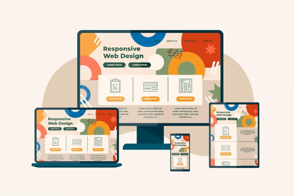
Responsive design isn’t just a technical term developers use. It’s a modern necessity. It ensures your website adapts smoothly to different screen sizes — whether someone is browsing on a smartphone, tablet, laptop, or even a large monitor.
In today’s world, your audience is everywhere. Your design needs to be too.
Let’s break down how to create a responsive design that not only works everywhere — but looks great everywhere.
What Responsive Design Really Means (In Simple Terms)
At its core, responsive design means flexibility.
Instead of building a website with fixed sizes and rigid layouts, you create a system that adjusts automatically based on screen size.
Think of it like water.
Pour water into a small glass — it takes the shape of the glass.
Pour it into a large bowl — it expands naturally.
Responsive design works the same way.
The layout, images, text, and spacing adapt depending on the device being used.
This is different from just being “mobile-friendly.”
A mobile-friendly site may technically work on a phone, but responsive design ensures it feels intentionally designed for every screen size — not just squeezed to fit.
That difference matters.
Why Responsive Design Is Critical Today
Let’s talk about reality.
Most users now browse on mobile devices. In many industries, more than half of website traffic comes from smartphones.
If your website doesn’t perform well on mobile, you’re potentially losing half your audience.
But it’s not just about traffic.
It’s about expectations.
People expect smooth experiences. They expect fast loading times. They expect buttons that are easy to tap. They expect content that’s readable without zooming in.
If your site doesn’t deliver that experience, they won’t struggle through it — they’ll leave.
And when users leave quickly, it affects more than just conversions. It can impact your search rankings too.
Search engines prioritize mobile usability. A responsive website supports better performance, stronger engagement, and improved visibility.
Responsive design is no longer optional.
It’s the standard.
The Core Principles of Responsive Design
Creating a responsive website isn’t about random adjustments. It follows a few core principles.
Let’s simplify them.
Fluid Grid Systems
Older websites were built with fixed widths. For example, a layout might be set to 1200 pixels wide — no flexibility.
That approach doesn’t work today.
Responsive websites use fluid grids. Instead of fixed pixel values, elements are sized using percentages.
This allows sections of the page to expand or shrink based on screen size.
The result?
Balanced layouts on both small and large screens.
Flexible Images and Media
Images are often where responsive design breaks.
If an image is too large and not scalable, it can overflow on smaller screens. If it’s not optimized, it can slow down mobile performance.
Responsive images scale within their containers. They resize proportionally without distortion.
This ensures:
- No broken layouts
- No awkward cropping
- No horizontal scrolling
Images should support the design — not disrupt it.
Media Queries
Without getting too technical, media queries are rules that tell the website how to behave at different screen sizes.
For example:
- On mobile, stack elements vertically
- On tablet, adjust spacing
- On desktop, show multi-column layouts
These rules allow designers to fine-tune the experience for different devices.
It’s not about making everything smaller.
It’s about redesigning intelligently for each screen.
Mobile-First Thinking
Here’s a powerful mindset shift:
Instead of designing for desktop first and shrinking everything down, start with mobile.
Why?
Because mobile forces clarity.
On a small screen, you can’t hide behind clutter. You must prioritize essential content. You must simplify navigation. You must focus on what truly matters.
Once the mobile version works perfectly, expanding it to larger screens becomes easier.
Mobile-first design often leads to cleaner, stronger websites overall.
Designing for Different Screen Sizes
Let’s talk practically about how design should adapt across devices.
Mobile Devices
Mobile design should feel focused.
This means:
- Clear, simple navigation
- Large tap-friendly buttons
- Readable font sizes
- Limited distractions
On mobile, space is limited. So every element must earn its place.
Avoid overwhelming users with too many sections stacked endlessly. Prioritize the most important message first.
Remember: people scroll easily on mobile. But they won’t tolerate confusion.
Tablets
Tablets sit between mobile and desktop.
They offer more space than phones but less than laptops.
The key here is balance.
Layouts should breathe. Text shouldn’t stretch too wide. Visual hierarchy should remain strong.
Design shouldn’t look like a “stretched mobile version” or a “shrunk desktop version.”
It should feel intentional.
Desktops and Large Screens
Large screens create a different challenge.
Too much empty space can make a website feel disconnected. But too much stretching can hurt readability.
The solution?
Use white space strategically.
Wide screens allow you to create elegant layouts with strong visual balance. But content width should remain controlled for readability.
Responsive design isn’t about filling every pixel. It’s about maintaining harmony at every size.
Typography and Spacing: The Details That Make or Break Responsive Design
When people think about responsive design, they usually focus on layout. But typography and spacing are just as important.
A design might technically “fit” on every screen, but that doesn’t mean it’s comfortable to read.
Text that looks perfect on a desktop monitor can feel overwhelming on a small phone screen. Long lines become difficult to scan. Font sizes that seem reasonable suddenly appear too small. Line spacing that felt subtle becomes cramped.
Responsive typography means allowing your text to scale naturally across devices.
Font sizes should adjust depending on screen size. Line height should remain comfortable. Paragraph width should be controlled so that reading never feels like a chore.
Spacing plays an equally important role.
White space isn’t wasted space. It improves focus. It guides attention. It gives your design room to breathe.
On smaller screens, spacing often needs to increase rather than decrease. Crowded content on mobile creates friction. Thoughtful spacing creates clarity.
A responsive design doesn’t just resize content. It reshapes it for readability.
Performance Still Matters in Responsive Design
There’s another factor many businesses overlook when creating responsive websites: performance.
Just because a layout adapts to screen sizes doesn’t mean it performs well.
Mobile users are often on slower networks. Heavy design elements that load fine on desktop Wi-Fi may feel painfully slow on mobile data.
Large images, background videos, complex animations — all of these affect loading speed.
And speed directly impacts user satisfaction.
A responsive website should not only look great everywhere. It should load quickly everywhere.
This means optimizing images properly, reducing unnecessary scripts, and avoiding decorative elements that don’t add functional value.
Design should enhance experience — not delay it.
Common Responsive Design Mistakes to Avoid
Even experienced teams sometimes fall into common traps.
One major mistake is designing for desktop first and trying to “fix” mobile later. When mobile adjustments are treated as secondary, the result often feels like a compromise.
Another mistake is hiding important content on mobile to simplify the layout. While simplifying is good, removing valuable information can harm usability and SEO.
Then there’s the issue of fixed-width elements. If certain sections don’t adapt fluidly, they create horizontal scrolling or awkward alignment issues.
Sometimes designers also underestimate testing. A website might look perfect on one device but break on another.
Responsive design is not just about shrinking content. It’s about rethinking how content flows at every size.
Testing: The Step You Should Never Skip
You cannot assume a design is responsive just because it was built that way.
Testing is essential.
Resize your browser window manually and observe how the layout adapts. Use developer tools to simulate different screen sizes. Test on real devices whenever possible.
What feels smooth on a large screen may behave differently on an actual smartphone.
Pay attention to small details:
Does the navigation menu open smoothly?
Are buttons easy to tap?
Does text wrap correctly?
Do images maintain proportion?
Even minor issues can create friction for users.
The goal is consistency.
Your website should feel intentional and polished, no matter how it’s accessed.
Creating a Responsive Design That Truly Looks Great Everywhere
At the end of the day, responsive design isn’t just about technical adjustments.
It’s about mindset.
Instead of asking, “How will this look on desktop?” start asking, “How will this feel on every device?”
Responsive design works best when it prioritizes:
Clarity over complexity.
Flexibility over rigidity.
Function over decoration.
A great responsive website:
Adapts smoothly.
Maintains readability.
Loads quickly.
Feels intuitive.
Builds trust instantly.
It doesn’t force users to zoom in.
It doesn’t make them hunt for buttons.
It doesn’t overwhelm them with clutter.
It simply works.
And when a website simply works, users stay longer. They explore more. They convert more confidently.
Final Thoughts
The digital world is no longer limited to one screen size.
Your customers browse during commutes, in offices, at home, and on the go. They switch between devices throughout the day. Your website needs to support that behavior seamlessly.
Responsive design ensures your brand looks professional and consistent everywhere.
It protects your credibility.
It improves user experience.
It supports search visibility.
And most importantly, it respects your audience’s time.
Creating a responsive design that looks great everywhere is not about chasing trends. It’s about building flexibility into your foundation.
When flexibility becomes part of your design philosophy, your website doesn’t just survive across devices.
It thrives.